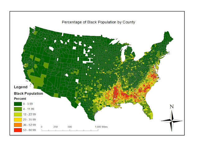
 This map shows the percentage of the Black population by counties in America. We can see that the swath of the South Eastern states have a high population of black people, which includes Louisiana, Mississippi, Alabama, Georgia, Florida, the Carolinas, Virginia, etc. This region of the United States has historically been populated with a higher concentration of African Americans and we can see that this trend is continuing. There are also a couple scattered areas that have a high percentage of African American population in California, and parts of the North East.
This map shows the percentage of Asian population by counties in the United States. The most highly concentrated areas of Asian population California, with some areas in northern and southern California where the percentage of Asian population ranges between 21 - 46.9%. There are also a few areas of highly concentrated Asian populations in Washington state and the North East, but the biggest Asian population is clearly in California.
This map shows the percentage of population that affiliate with "other race" on the census. These groups are largely concentrated in the South Western swath of states and decrease as you move East across the country. On the East side of the United States we can see a concentration of those who associated with "other race" in Florida and along the East Coast. This may indicate the large amount of Mexican immigrants in the South East and the large amount of Puerto Ricans in Florida. All of these maps show that there are clearly defined clusters of different races throughout the United States.I enjoyed working on this lab because it's interesting to observe the patterns of different races in the country. Looking back on these maps, I feel like it would have been more effective if I had used shades of the same color to display the distribution and concentrations of races. I think it would make the patterns easier to see as well as easier to compare the three maps. GIS gives so many options for the visual display of data, and this is just one example of how we can highlight social patterns within the country.


No comments:
Post a Comment