Tuesday, November 27, 2012

Assignment 8


The Los Angeles station fire lasted from August 29, 2009 to September 2, 2009. The fire spread from the edge of metropolitan LA towards the Mojave desert. The reference map that I have included shows the spread of the station fire's perimeter over the five days that the fire was actively expanding. Although most of the fire took place in a relatively rural area an article in the Los Angeles Times says, "more than 12,500 homes were threatened and 6,600 were under mandatory evacuation." The aspects of the fire that I have focused on are the surface fuels within the perimeter of the station fire, and how these fuels combined with the slope of the area aided in the spread of the fire. 

The fuel model map within the fire perimeter shows clearly that most of the land is covered with tall chaparral, which is a common plant variety in the shrublands of the state. California's mediterranean climate has wet winters and dry summers, during which plants and soil dry out and can add to a fire's severity. Most fires we see in California occur in the late summer or early fall because this is when the terrain is driest and most susceptible to wildfires. Other fuel sources we can see within the fire perimeter are light brush, hardwood/light conifer, and medium conifer. 

The next map shows the rank of the fuel sources within the fire's perimeter. Fuel ranks are used to proactively take on pre-fire projects that may reduce the severity of wildfires. The California Fire and Resource Assessment Program (FRAP) describes fuel rank as a combination of the fuel model and the slope of the area. We can see that the area covered with tall chaparral in the fuel model map corresponds with the very high hazard level on the fuel rank map. Also the land covered with light and medium conifer is ranked as a moderate hazard. 

The last map that I have included shows the slope of the terrain within the fire perimeter. According to an article published by the Wildfire Management Branch of British Columbia, "the steepness of the land has the greatest influence on fire behavior." Slope affects the speed and direction of the fire spread, and the steeper the slope is, the faster the fire will spread. The article sights these five reasons for this phenomenon: 
  • on the uphill side, the flames are closer to the fuel;
  • the fuels become drier and ignite more quickly than if on the level ground;
  • wind currents are normally uphill and this tends to push heat flames into new fuels;
  • convected heat rises along the slope causes a draft which further increases the rate of spread; and
  • burning embers and chunks of fuel may roll downhill into unburned fuels, increasing spread and starting new fires.
While looking at all three maps it is clear that the slope and the fuel type of the surface area had a huge affect on the 2009 station fire. The areas with the steepest slope, also happen to be covered with shrubbery and brush which burn quickly and act as kindling to fires. These two things combine to create a highly hazardous fuel rank which covers the majority of the fire's area. InciWeb: Incident Information System says that this was "the largest fire in the recorded history of Los Angeles National Forest (est. 1892) and the 10th largest fire in California since 1933." Hopefully we can use maps like these to prevent future fires in the area of Los Angeles and abroad. 


Works Cited

"Fuel Ranking Maps and Data." California Fire and Resource Assessment Program, n.d. Web. 10 Dec. 


Garrison, Jessica, Alexandra Zavis, and Joe Mozingo. "Station Fire Claims 18 Homes and Two Firefighters." Los Angeles Times, 31 Aug. 2009. Web. 10 Dec. 2012 <http://articles.latimes.com/2009/aug/31/local/me-fire31>.

Greninger, Mark. "Los Angeles County Enterprise GIS." Los Angeles County Enterprise GIS. N.p., 2 Sept. 2009. Web. 10 Dec. 2012. 

"HOTSPOT: California On The Edge." HOTSPOT: California On The Edge. California Academy of Sciences, n.d. Web. 10 Dec. 2012. <http://www.calacademy.org/exhibits/california_hotspot/habitat_mediterranean_shrublands.htm#fire>

"Los Angeles County DEM." Week 9: GIS Application. Geography 7: Intro to GIS, n.d. 10 Dec. 2012. <https://classes.sscnet.ucla.edu/course/view/12F-GEOG7-1?topic=9>

"Ministry of Forests and Range, Wildfire Management Branch." Fire Behaviour. British Columbia, Wildfire Management Branch, n.d. Web. 10 Dec. 2012 <http://bcwildfire.ca/FightingWildfire/behaviour.htm>.

"Station Fire." InciWeb: Incident Information System. N.p., 10 Nov. 2009. Web. 10 Dec. 2012. <http://www.inciweb.org/incident/1856/>

"Surface Fuels Maps and Data." California Fire and Resource Assessment Program, n.d. Web. 10 Dec. 2012. <http://frap.cdf.ca.gov/data/fire_data/fuels/fuelsfr.html>

Tuesday, November 20, 2012

Assignment 7

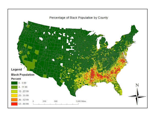
This map shows the percentage of the Black population by counties in America. We can see that the swath of the South Eastern states have a high population of black people, which includes Louisiana, Mississippi, Alabama, Georgia, Florida, the Carolinas, Virginia, etc. This region of the United States has historically been populated with a higher concentration of African Americans and we can see that this trend is continuing. There are also a couple scattered areas that have a high percentage of African American population in California, and parts of the North East.  
This map shows the percentage of Asian population by counties in the United States. The most highly concentrated areas of Asian population California, with some areas in northern and southern California where the percentage of Asian population ranges between 21 - 46.9%. There are also a few areas of highly concentrated Asian populations in Washington state and the North East, but the biggest Asian population is clearly in California. 
This map shows the percentage of population that affiliate with "other race" on the census. These groups are largely concentrated in the South Western swath of states and decrease as you move East across the country. On the East side of the United States we can see a concentration of those who associated with "other race" in Florida and along the East Coast. This may indicate the large amount of Mexican immigrants in the South East and the large amount of Puerto Ricans in Florida. All of these maps show that there are clearly defined clusters of different races throughout the United States.

I enjoyed working on this lab because it's interesting to observe the patterns of different races in the country. Looking back on these maps, I feel like it would have been more effective if I had used shades of the same color to display the distribution and concentrations of races. I think it would make the patterns easier to see as well as easier to compare the three maps. GIS gives so many options for the visual display of data, and this is just one example of how we can highlight social patterns within the country.

Tuesday, November 13, 2012

Assignment 6

3D Model

The area that I have selected includes part of the 405 freeway running from North to South in the center of the chosen area. Stone Canyon is located on the right hand side at the top of the area with Beverly Hills to the southwest, and Bel Air directly south of Stone Canyon. Topanga Canyon is on the left side of the 405 in this selected area. The geographic coordinate system used is North American 1983 which uses a latitudinal and longitudinal coordinate system. The extent information in decimal degrees is:
     Top: 39.829167
     Left: -105.788889
     Right: -104. 969445
     Bottom: 39.383889

Monday, November 12, 2012

Assignment 5

Mollwiede Projection (equal area)
Distance from DC to Kabul in miles:
Planar: 7,925
Geodesic: 6,934
Loxodrome: 7,925
Cylindrical Equal Area Projection
Distance from DC to Kabul in miles
Planar: 10,108
Geodesic: 6, 934
Loxodrome: 8,112


Azimuthal Equidistant Projection
Distance from DC to Kabul in miles:
Planar: 8,341 miles
Geodesic: 6,934
Loxodrome: 8,112
Sinusoidal Projection (equidistant)
Distance from DC to Kabul in miles:
Planar: 8,098
Geodesic: 6,934
Loxodrome: 8,098

Stereographic Projection (conformal)
Distance from DC to Kabul in miles:
Planar: 9,878
Geodesic: 6,934
Loxodrome: 8,112
Mercator Projection (conformal)
Distance from DC to Kabul in miles:
Planar: 10,112
Geodesic: 6,934
Loxodrome: 8,112

Map projections are a way to enable the reshaping of Earth by converting spherical coordinates (x, y, and z coordinates) to two dimensional coordinates (x, y coordinates). This process distorts either the shape, area, distance, or angle, and often some of these at once. Each projection causes different distortions of the earth, which you can see in the six projections that I have chosen. Picking the proper projection mostly has to do with the purpose of the map and the qualities that are most important to you. The three main types of maps are conformal which preserves angles, equidistant which preserves distance, and equal area which preserves the proper area. Even though there is some consistency within each general type of projection, you can see that there is still some variation in the distance between DC and Kabul on all of the maps. 

The first two projections are equal area projections. The cylindrical equal area projection preserves the area of the earth's features. A cylindrical projection refers to the way the map was created - by essentially wrapping a piece of paper around the globe. There is the least amount of distortion at the equator with growing distortion at the poles. The Mollwiede is an equal area pseudocylindrical projection which shows the equator as a horizontal line and meridians that compress near the poles. The next two maps are both equidistant projections. The Sinusoidal projection conserves the distances along the meridians and the Azimuthal equidistant conserves distances along great circles (a great circle is a full meridian circle). The last two projections are conformal projections. The Mercator projection is an old and well known conformal projection and is easy to spot because the lines of latitude and longitude intersect at 90 degree angles. Lastly, the Stereographic projection projects the shape of the earth's spree as a plane. All of these projections have pros and cons depending on the purpose of the map. 

A huge drawback to map projections is that there is a lot of distortion. As you can see the distance between Washington DC and Kabul varies greatly depending on which map you are looking at. The equidistant map projections (the Sinusoidal and the Azimuthal equidistant projections) both show that the distance is about 8,000 miles. But even between the two there is discrepancy. Other maps distort area and makes certain countries look bigger or smaller than they should. 

Although globes are the most accurate way to display the world with little error, globes are not the most practical tools for most mapping applications. Map projections have great potential depending on the purpose of your map. Map projections allow us to analyze aspects of the earth on many scales and in many different ways. The computer's ability to create thousands of projections increases the ways we can look at the world as opposed to the traditional planar, conic, and cylindrical projections that we have achieved from theoretically wrapping a piece of paper around a globe. Although we need to be careful and aware of any errors a map projection may create, map projections have a lot of potential and are an extremely important part of GIS and geography.