1. The name of this quadrangle is the Beverly Hills Quadrangle
2. The names of the adjacent quadrangles are: Canoga Park, Van Nuys, Burbank, Topanga, Hollywood, Venice, and Inglewood
3. The quadrangle was first created in 1995
4. The datum used to compile this map was the North American Datum of 1927 (NAD 27) and National Geodetic Vertical Datum of 1929
5. The scale of the map is 1:24,000
6. At the above scale:
a) 5 centimeters on the map is equivalent to 1,200 meters on the ground
b) 5 inches on the map is equivalent to 1.89 miles on the ground
c) one mile on the ground is equivalent to 2.64 inches on the map
d) three kilometers on the ground is equivalent to 12.5 centimeters on the map
7. The contour interval of the map is 20 feet
8. The approximate geographic coordinates in both degrees/minutes/seconds and decimal degrees of:
a) the Public Affairs Building: W118°26'20'' (-118.4389), N34°4'20'' (34.0722)
b) the tip of Santa Monica pier: W118°30'00'' (-118.5), N34°0'25' (34.00694)
c) the upper Franklin Canyon Reservoir: W118°24'30'' (-118.4083), N34°7'15'' (34.12083)
9. The approximate elevation in both feet and meters of:
a) Greystone Mansion: 560 feet/170.7 meters
b) Woodlawn Cemetery: 140 feet/42.7 meters
c) Crestwood Hills Park: 680 feet/207.3 meters
10. The UTM zone of the map is zone 11
11. UTM zone coordinates for the lower left corner of the map are 3763000 N and 361000 E
12. There are 1,000,000 square meters contained within each UTM
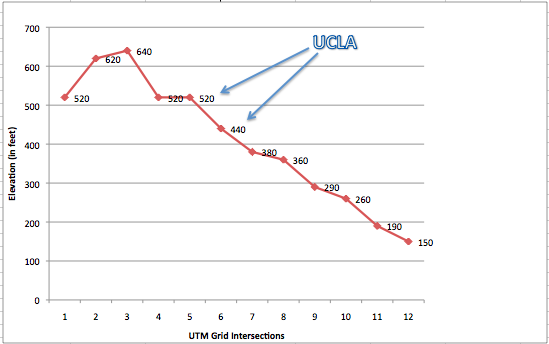
13. Elevation profile of the UTM grid intersections along the UTM northing 3771000:
14. The magnetic declination of the map is 14 degrees
15. The intermittent stream runs from North to South
16. And here is UCLA, cropped from the map:
Tuesday, October 9, 2012
Wednesday, October 3, 2012
Assignment 1
This map shows how many major cities can fit inside the Los Angeles city limits. It is from an article posted on LAist, a blog that covers news, culture, and events in Los Angeles and can be viewed here: http://laist.com/2012/06/30/map_how_many_major_us_cities_can_fi.php. The article does state that the original source for this map is unknown. The map shows that St. Louis, Milwaukee, Cleveland, Minneapolis, Boston, San Francisco, Pittsburgh, and Manhattan can all fit neatly within the city limits of Los Angeles, with some room to spare. The white space within the city limits make me wonder if there are perhaps other major cities that could fit snugly within this puzzle. After moving to Los Angeles from San Francisco just a couple of weeks ago, I am still struck by the immense size difference between the two cities. This map is an effective display of just how big the city of Los Angeles really is. It also acts as an interesting way to put the relative sizes of these major cities into perspective.
This map from the New York Times website shows the number of times sweet potato casserole recipes were searched for on the night before Thanksgiving of 2009. Above is a screenshot, but the map found here is interactive: http://www.nytimes.com/interactive/2009/11/26/us/20091126-search-graphic.html. As you scroll over each state you can see the number of searches for sweet potato casserole and how that compares to the national average. I chose to show this particular map because this was the most common recipe that was searched for on that day, but the website does provide the distribution of the top 50 searched recipes - pumpkin pie, green bean casserole, and pecan pie were the next most popular searches on the list. These maps show that although Thanksgiving is a national holiday, we do see differences in the cooking trends and traditions within the country. It is interesting to see the clustering of above average searches in the southern states. It is tempting to conclude that sweet potato casserole is just a southern tradition, however the map simply shows who searched for the recipe and not necessarily who actually consumed this casserole in question.
This next map, also from the New York Times website, is a display of how states may vote in the presidential election this November. These results are based on polling, previous electoral results, and the political geography of each state. This is the link to the interactive version on the New York Times website: http://elections.nytimes.com/2012/electoral-map. The size of each state indicates the number of electoral votes that state has and the color indicates if that state is a strong Democratic state, a strong Republican state, a state that is leaning in either direction, or a tossup state. I think that displaying the size of a state based on the number of electoral votes it holds is a clear and simple way to portray the power and influence they may have over the upcoming election. While the map does clearly show clustering of political views throughout the country, it does not show variation of views within each state. It is interesting that many of the yellow tossup states are sandwiched between strong Democratic states and strong Republican states. The tossup state of Nevada, for example, is situated between the strong Democratic state of Oregon and the strong Republican state of Utah. I think this map is an effective visualization of the political views across the country and how those views may influence the results of this election.
Subscribe to:
Posts (Atom)